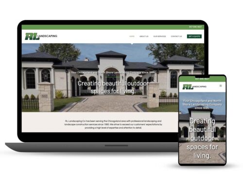
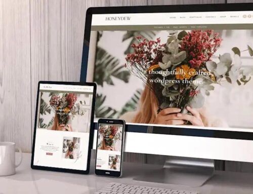
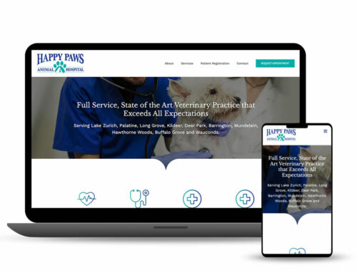
Responsive Web Design (RWD)
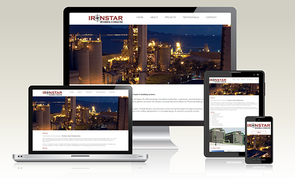
Since the popularity of smart phone, tablets and mini-tablets began, business owners have been asking for mobile versions of their websites. In the field of web design and development, it was quickly getting to the point of being unable to keep up with the endless new resolutions and devices. That is where Responsibe Web Design (RWD) comes in.
RWD is the approach that suggests that design and development should respond to the user’s behavior and environment based on screen size, platform and orientation. The practice consists of a mix of flexible grids and layouts, images and an intelligent use of CSS media queries. As the user switches from their laptop to iPad, the website should automatically switch to accommodate for resolution, image size and scripting abilities. In other words, the website should have the technology to automatically respond to the user’s preferences. This would eliminate the need for a different design and development phase for each new gadget on the market.
Baldwin Web Design is developing custom RWD sites as well as in WordPress. Contact us for a quote and a free site evaluation.
About the Author: admin