Avoid These Mistakes on Your Website
1. No Clear Brand Messaging
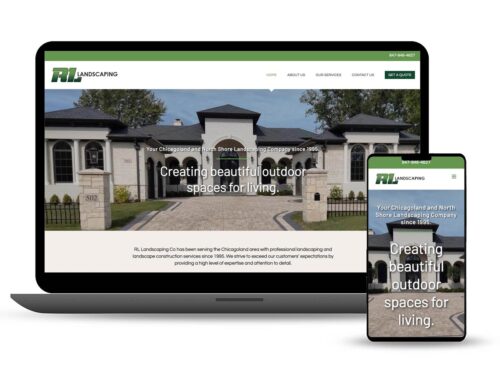
Towards the top of the home page state clearly who you are and what you do. As a follow on message, state what you want your visitors to do. With no clear messaging, visitors will be unsure they are in the right place and won’t stick around for long, increasing your bounce rate. Here is a great brand message with clear call to actions (CTAs) from an employment agency:

2. No CTA
Speaking of CTAs (Call to Actions), What do you want visitors to do? Buttons should be in contrasting colors and have a clear “I want to…” action.
I want to…
- Get a Free Quote
- Download Our Free Guide
- Register For Free Webinar
- Buy This Widget Now

3. Not Mobile Friendly
Since 2015 Google began favoring mobile-friendly websites in search results. According to Google “This change will affect mobile searches in all languages worldwide and will have a significant impact in our search results.” In 2018 Google stepped it up and started indexing mobile versions first, prioritizing them over desktop versions. If your website isn’t mobile-friendly, you run the risk of not being found in Google searches and your visitors hate it!
4. No SSL
SSL, or Secure Sockets Layer, is a protocol used for secure and encrypted communication between computers. If you have any kind of login form, contact form, shopping cart or if you accept sensitive credit card payment details, this encryption is not only necessary but tells your customers you care about them and are keeping their data secure. Recently Google announced that it would include SSL as a ranking factor in its search algorithm, so it’s become best practices for every site to have an SSL certificate.
5. Not having “Essential pages”
Standard pages you should have on your site include: About Us, Contact Us, Privacy Policy and Sitemap. These pages are expected and predictable and relied on by your visitors to find information quickly. Search engines also look for these pages and when found with quality content, see you as a credible and reliable source.
6. Social Icons in Header
Your goal is to drive traffic to your website and convince visitors to take an action: fill out a contact form, pick up the phone, buy the product. You don’t want the first thing they see in the header to be social media links. You are asking them to leave your site before they have had a chance to browse and take that action. Once they click on your Facebook or YouTube link, you have lost them. Place those icons in the footer, they won’t be offended. Remember you should be using social media to drive traffic to your site, not using your website to drive traffic to social media!
7. Low Contrast: Text vs. Background
In some instances soft font colors and design elements look sophisticated and modern but if there is not enough contrast between the text and background you have an accessibility issue, which could be a ding to your SEO ranking. You are also losing conversions. Increase actions by using contrasting colors in headings, buttons and especially labels on contact forms.
8. Not Enough White Space
White space is essential to good design and makes content more legible and allows user to focus on the elements surrounding the text. If the layout is crowded and line spacing too tight, you have readability and accessibility issues.
9. Overuse of Dark Backgrounds and White Text
Sections are OK and can add visual interest but overuse is hard on the eyes and looks dated
10. Too Many Stock Images
Real images that convey brand of company have more of an impact than stock photography. A stock image or two to fill in the gaps of missing images is acceptable, but don’t overuse them. Original images leaves the impression of authenticity. Another benefit is higher conversion rates. Read this interesting study from WVO, Conversion rates increased by over 160% by swapping out a stock photo for an original.

11. Images Not Optimized for Web
WordPress and other CMS platforms allow the site owners to edit their websites themselves, which is great as long as they are educated on the subject of image sizes. I have seen many sites where large images (4000 px wide and up!) are uploaded and added to pages and posts. They are slowing down your site and annoying visitors with slow page loads. There is no reason to have images larger than 1400px wide for full width and 900-1200 px wide for content. Edit your images before uploading or use your CMS’s image editor. There are many plugins available that can compress images further. Page speed is a huge factor in SEO ranking and should not be overlooked.
12. Misuse of Popups
If you’re going to use a pop-up, just use one, and use it sparingly. Also make sure what you’re asking people to do with your pop-up is actually useful, and not just a distraction from what they’re trying to achieve. Studies have shown pop-ups do increase conversions but you run the risk of losing visitors if annoying. A good solution is to activate the pop-up on exit so the user sees it before leaving the site.
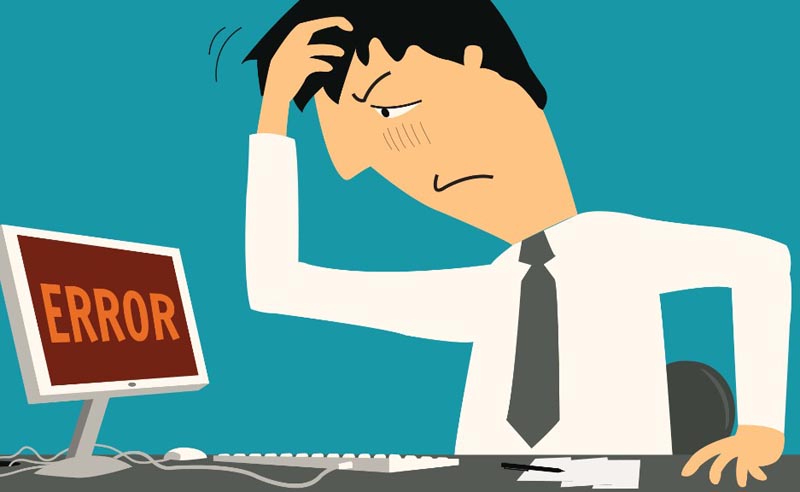
13. 404 Errors
Don’t lose visitors due to outdated links or changed URLs. Implement redirection for changed or deleted posts and pages. WordPress has simple plugins that will either redirect missing pages and posts to the home page (or any other page).
Let’s Talk About Your Website
Get your Free Consultation
About the Author: Carla Baldwin